Transitland’s global map of transit has an ambitious goal: to map buses, trains, subways, cable cars, ferries, and other modes of public transit across all urban and rural regions where we can source standardized open-data feeds. While the data feeds may be standardized, every route/trip/stop record also represents the manifestation of local history, politics, and economics — factors that can vary widely from country to country, or metro region to metro region. When we design our map of transit to be consistently usable and understandable across the world, we also touch on questions unique to each place.
Earlier this year, Jeffrey Tumlin, director of the San Francisco Municipal Transportation Agency, took the time to discuss with our team some of the complicated questions raised by Transitland’s global map (and by similar transit navigation apps):
- Why are intercity trains, which only serve their riders a few times a day, often displayed more prominently than bus routes that actually provide much more frequent service?
- When transit agencies offer a network of high-frequency bus service, how can riders identify this backbone to reach the nearest “entry point” and to plan transfers to most efficiently reach their ultimate destination?
- Are colors a meaningful way to brand rail lines or high-frequency bus lines in a regional context, particularly if multiple overlapping agencies end up selecting the same colors for different lines?
The discussion was spirited: Tumlin shared how his current experience leading a major US transit agency and his previous experience consulting internationally highlights how much of an outlier the US is in terms of privileging rail transit over bus transit. Legacies of racism continue to shape the transit networks of today. Whether transit service is provided to riders by a bus with rubber wheels or a train on steel tracks still resonates in an almost cultural manner, aside from the practicalities of whether the route will help riders reach their destinations.
The discussion was also optimistic: SFMTA is strengthening its network of bus routes with service of at least every 10 minutes. As frequencies increase further, riders are finding it even more convenient to quickly transfer from one high-frequency route to another. As a square of roughly 7 miles by 7 miles, San Francisco is now covered by a grid of high-frequency bus routes, enabling riders to travel “diagonally” with a single transfer with minimal wait time. SFMTA may stand out in the Bay Area in this respect, but it’s using patterns long common to other parts of the world and increasingly adopted in the dense cores of more American cities.
Based on input from Tumlin, as well as from SFMTA transit planner Steve Boland, we’ve tuned the Transitland global map.
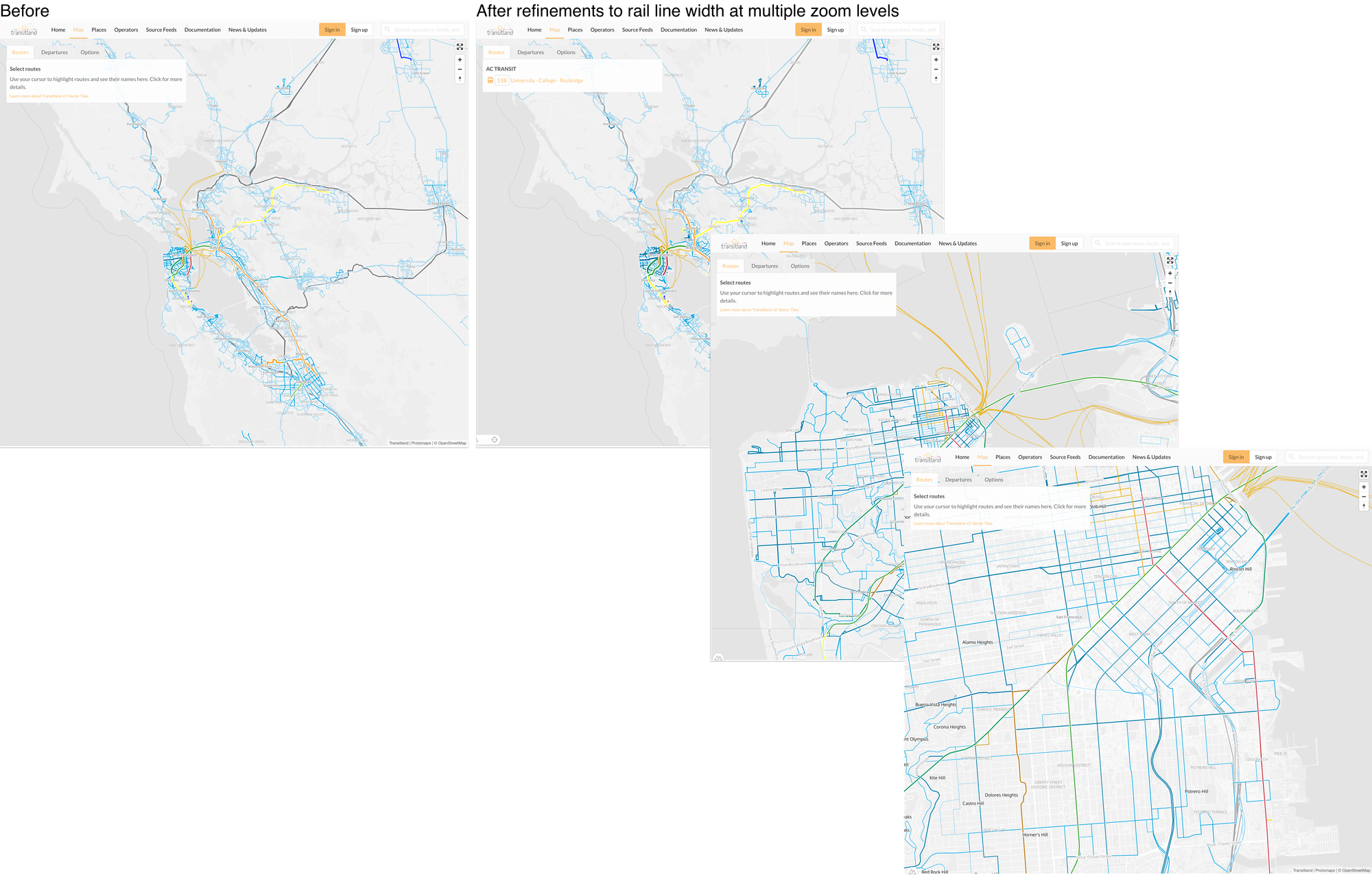
Rail routes are now zoom-level dependent
Rail lines continue to be more prominent at national or region-wide views. As you zoom into a city or neighborhood scale, rail lines now shrink to be equally sized with bus lines:

This change reflects how rail lines are helpful for riders orienting across broader viewers and relevant for traveling longer distances, but for intra-urban travel, a bus may often be competitive if not better than a rail-based transit service.
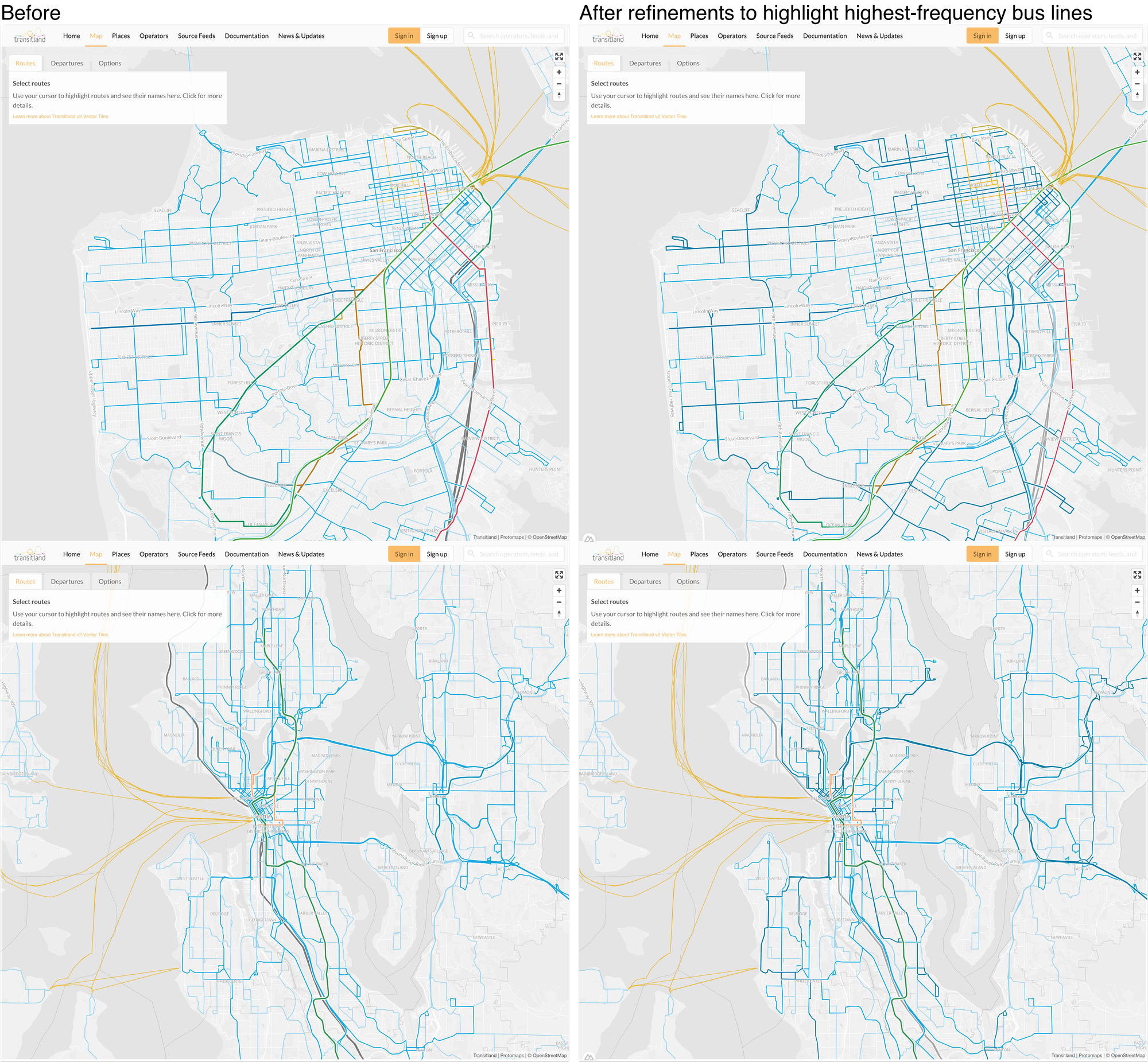
Bus routes are grouped by styling
Previously, our map classified buses routes into two groups by their frequency: less frequent routes were styled with a lighter blue color, more frequent routes were styled with a darker and more prominent blue.
Now our map groups buses into three different groups by their headway (the term that transit planners use to refer to how frequently a transit service operates):

In cities and metros with a network of high-frequency service, this change will help to emphasize that subset of fast and dependable service, while still also showing connections with less frequent bus services that provide coverage.
Onward
We’re working on some longer term improvements to the way bus and rail route shapes are handled within the Transitland software stack, and we look forward to sharing more in the future.
It’s also always a pleasure to place the work we do with data and software within the broader context of public transit in the US. Thanks to SFMTA staff for a lively conversation and useful feedback!


